
Simon Knowles Motion
· Branded Communications
Start a conversation
→
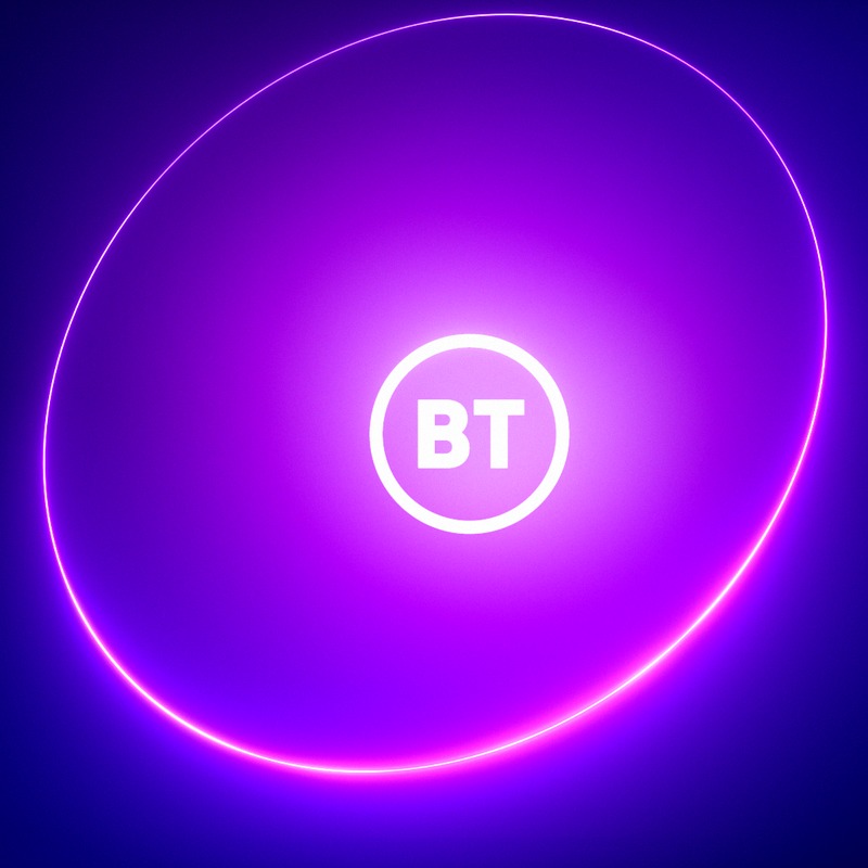
The 8K master renders of BT's new brand device, delivered four days before the relaunch, the company's first identity change since 2003.
In June 2019 BT revealed a new logo to replace the globe it had used since 2003. The Beyond Limits relaunch followed on 17 October 2019. At the centre of the new identity was the Portal, a circular brand device designed by Red&White. Not a logo in the conventional sense. A dimensional, luminous ring that opens from nothing into the brand mark, then opens again into content.
It had to hold up everywhere BT appeared. Broadcast, digital out of home, social, print, event, environmental. Saatchi & Saatchi needed it rendered at 8K, full bleed, with the passes separated so their in house team could recrop and rescale for surfaces that did not have a spec yet. Prodigious London brought me in to produce the masters.
The Portal is easier to describe than to build. A ring appears from nothing. It pulses. Light sweeps rotate around it. The internal volume glows from the centre. The ring opens to reveal the wordmark, opens again to reveal content, then closes.
Every one of those moments is a separate 3D pass. Seven in total: the ring itself, the initial glow sweeps, two layers of rotating glow, internal volumetrics, a matte for the content reveal, and a second matte for the distortion at the rim. Rendered in Cinema 4D R20 with Octane 4 at 8K, composited in After Effects at 32 bit float.

01 Ring

02 Matte

03 Glow

04 Volumetrics
05 Composite
Rendering at 8K with the passes held separate is not a quality decision. It is a format decision. Once the Portal existed as layers rather than a flat frame, the glow could be rebalanced for a stadium screen without a re render, the matte could be recut for a 9:16 crop, and the composite could be rebuilt for any surface that came along later.
That mattered more than anyone knew at the time. The Portal was redeveloped roughly twelve months after launch to flex across colour and light, and was refreshed again later. Because the master existed as layers, that redevelopment did not have to start from scratch.
Red&White designed the Portal. Saatchi built the campaign around it. I rendered the master asset.
That distinction is worth being precise about, because the craft at the base of a durable brand system is invisible by design. The system only lasts if the base was right. A misjudged glow volume, a matte that breaks at scale, both travel through every subsequent use of the device for as long as the brand runs it.
Landmark relaunches are decided in the final four days. The creative has been argued over for months. The system has been designed and signed off. Then someone has to actually render it, at 8K, full bleed, by Friday.
That last mile is where motion stops being a service and becomes a craft discipline.